


Mobile-First Design for Wedding Professionals
Here’s a statistic that should get your attention: The vast majority of couples browsing wedding vendor websites are doing it on their phones, not their laptops.
Not on desktop during work hours. Not on their laptop at home. On their phone while scrolling Instagram during lunch, waiting in line for coffee, or lying in bed planning their dream wedding.
And if your website doesn’t work beautifully on mobile, you’re losing potential bookings before they even reach your contact form.
After designing hundreds of wedding industry websites, I’ve seen this pattern repeatedly: a photographer books a consultation and the couple mentions, “We almost didn’t reach out because your website was difficult to navigate on our phones.” That’s revenue walking away because of a technical issue you didn’t even know existed.
Today I’m breaking down why mobile-first website design isn’t optional anymore and exactly how to optimize your wedding business site for the device your ideal clients are actually using.
The Mobile Reality of Wedding Planning
Let’s start by understanding how your potential clients actually browse and book vendors.
The Modern Couple’s Search Journey:
- They see a stunning wedding on Instagram
- They tap through to the vendor’s profile
- They click the link in bio on their phone
- They browse the entire website on mobile right there
- If they like what they see, they inquire or save for later
- If your site is clunky on mobile, they bounce immediately
This entire journey happens in under three minutes, and it’s almost entirely on a phone.
According to analytics across client sites I’ve designed, here’s the actual breakdown:
- 72% mobile traffic
- 23% desktop traffic
- 5% tablet traffic
During peak wedding planning hours (evenings and weekends), that mobile number jumps above 80%.
Your couples are planning weddings on their phones while watching Netflix. They’re scrolling vendors during their commute. They’re comparing photographers while getting ready for bed.
If your website doesn’t work flawlessly on mobile, you’re invisible to the majority of your potential clients.
The 7 Mobile Design Principles Every Wedding Pro Needs
Let me break down exactly what makes a mobile experience work for wedding professionals.
1. Thumb-Friendly Navigation
On mobile, people navigate with their thumbs. Not a cursor, not a precise click, their thumbs.
What this means for your site:
- Buttons need minimum 44×44 pixel tap targets
- Important navigation should be within natural thumb reach
- Links need adequate spacing to prevent mis-taps
- Sticky navigation at the bottom often works better than top
Poor mobile nav: Tiny text links crammed horizontally at the top of the screen
Good mobile nav: Clear hamburger menu or bottom navigation bar with icons and labels that are easy to tap
2. Speed Is Critical
On mobile, every second of load time matters exponentially more because people are often on cellular data, not WiFi.
The harsh reality:
- 53% of mobile users abandon sites taking longer than 3 seconds to load
- Every 1-second delay in load time decreases conversions by 7%
How to speed up mobile performance:
- Compress all images to websize
- Implement lazy loading for images below the fold
- Minimize plugins and unnecessary scripts
- Use reliable, fast hosting (seriously, avoid budget hosts)
- Enable caching
That gorgeous hero image means nothing if potential clients leave before it loads.
3. Readable Text Without Zooming
If people have to pinch-to-zoom to read your content, you’ve already lost them.
Mobile text requirements:
- Body text minimum 14px font size
- Headings proportionally larger but not enormous
- Ample line height for comfortable reading
- High contrast between text and background
- Line length maximum 50 to 75 characters
Important note: Those beautiful script fonts you love? Use them very sparingly. They’re difficult to read on small screens.
4. Vertical Layout Logic
Mobile screens are tall and narrow. Design accordingly.
Think vertically:
- Stack content in single column layouts
- Avoid side-by-side elements that get squished
- Use vertical space generously with breathing room
- Break up long sections with white space and visuals
- Make call-to-action buttons full-width for easy tapping
What works beautifully on desktop (two-column layouts, wide image galleries) often needs complete reimagining for mobile.
5. Touch-Optimized Interactions
Hovering doesn’t exist on touchscreens. Every interaction must work with taps.
Mobile interaction design:
- Replace hover states with tap states
- Make clickable elements visually obvious
- Provide clear visual feedback when something is tapped
- Minimize dropdowns (they’re frustrating on mobile)
- Use accordions or expandable sections for collapsible content
Common mistake: Desktop navigation requiring hover to reveal sub-menus. On mobile, this creates a completely broken experience.
6. Forms That Don’t Frustrate
There’s nothing worse than trying to complete a contact form on your phone and having it be a terrible experience.
Mobile form best practices:
- Minimize required fields (only ask what you truly need)
- Use appropriate keyboard types (email keyboard for email, number pad for phone)
- Provide clear labels above fields, not inside them
- Make form fields tall enough for easy tapping
- Show helpful, specific error messages
- Consider simple “tap to call” or “tap to email” options
Reality check: The easier you make it to contact you on mobile, the more inquiries you’ll actually get.
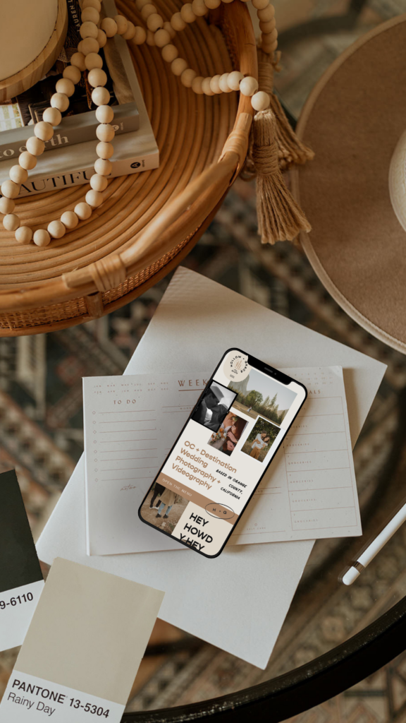
7. Strategic Image Display
Images are crucial for wedding professionals, but they need to work strategically on mobile.
Mobile image strategy:
- Use portrait-oriented hero images (they fill vertical screens better)
- Optimize image file sizes aggressively
- Implement lazy loading for gallery images
- Avoid image-heavy sections that take forever to load
- Consider different images for mobile versus desktop when appropriate
Example: That stunning five-image horizontal gallery on desktop? On mobile, stack those images vertically or use a properly optimized mobile slider.
Mobile Design Problems You Need to Fix Now
Let me point out mobile mistakes I see constantly on wedding professional websites:
Horizontal Scrolling
If visitors have to scroll sideways to see your content, they’re leaving. Period.
Check by opening your site on your phone and scrolling through each page. If anything extends past the screen width, you have a problem.
Tiny Tap Targets
A “Contact” link the size of a grain of rice? Unusable.
Test by trying to tap every link and button on your phone. If you miss and accidentally tap something else, your tap targets are too small.
Auto-Playing Videos
Auto-play videos consume mobile data and are genuinely annoying. Don’t implement this.
Pop-Ups That Can’t Be Closed
If visitors can’t close your email pop-up on mobile, they’ll close your entire site instead.
Unreadable Text
Requiring squinting to read your about page equals instant bounce.
Slow Load Times
Test your actual site speed. If it’s over 3 seconds on mobile, you’re actively losing money.
Testing Your Mobile Experience
Here’s your action plan for auditing your current mobile site:
The Manual Test (Do This Today)
- Pull out your phone
- Open your website
- Actually use it like a potential client would:
- Navigate to your portfolio
- Read your about page
- Try to contact you
- Browse your services/packages
- Look at your pricing if you display it
Be ruthlessly honest. Is it genuinely easy? Frustrating? Confusing?
The Google Test
Google provides a free Mobile-Friendly Test tool:
- Go to search.google.com/test/mobile-friendly
- Enter your URL
- Review what Google reports
If Google says your site isn’t mobile-friendly, you absolutely have work to do.
The Real-Person Test
Hand your phone to someone who’s never seen your site and ask them to:
- Find your contact information
- Look at examples of your work
- Understand what you do
Watch where they struggle. Those are your priority fixes.
Platform-Specific Mobile Optimization
Implementation varies depending on your website platform.
For Showit Websites
Showit makes responsive design relatively straightforward:
- Design your desktop site first
- Switch to mobile view in the editor
- Customize every page specifically for mobile
- Test thoroughly on actual devices
Critical: Don’t just auto-convert and assume it’s fine. Design your mobile version with as much intentionality as your desktop. This is one reason I recommend Showit for wedding professionals – you get complete control over both experiences.
For WordPress Websites
Your theme choice matters significantly.
What to look for:
- “Responsive” or “Mobile-First” explicitly stated in theme description
- Recent updates (abandoned themes create problems)
- Positive reviews specifically mentioning mobile experience
- Clean, efficient code
Consider hiring a developer to optimize if your current theme has problematic mobile performance.
For Squarespace or Wix
Most templates are mobile-responsive by default, but:
- You still need to customize specifically for mobile
- Test every single page
- Simplify where needed
- Manually optimize all images
Starting Fresh
If you’re beginning a new website design project, this is your opportunity to go mobile-first from day one.
Work with a website designer who:
- Shows you mobile mockups during the design process
- Tests on actual devices, not just browser tools
- Understands mobile-first principles thoroughly
- Can optimize effectively for loading speed
Measuring Mobile Experience Success
Track these specific metrics to evaluate effectiveness:
Engagement Depth:
- Average pages per mobile session (higher indicates better flow)
- Time spent on key pages from mobile (longer indicates interest)
- Portfolio exploration patterns on mobile
Inquiry Quality:
- Detail level in inquiries from mobile users
- Budget alignment rate from mobile inquiries
- Mobile inquiry to consultation conversion rate
Mobile Journey Efficiency:
- Time from first mobile visit to inquiry
- Mobile inquiry to consultation conversion
- Consultation to booking rate from mobile leads
These metrics provide actual insight into mobile experience effectiveness beyond simple traffic numbers.
Your Mobile-First Action Plan
Here’s what to do immediately:
This Week:
- Test your site thoroughly on your phone (every page)
- Run Google Mobile-Friendly Test
- Check mobile speed score via PageSpeed Insights
- Document every issue you discover
This Month:
- Prioritize fixes (critical mobile issues first)
- Optimize all images for mobile performance
- Simplify mobile navigation structure
- Test contact forms specifically on mobile
- Collect feedback from recent clients about mobile experience
This Quarter:
- Implement all priority fixes
- Redesign mobile experience if needed
- Establish ongoing mobile performance monitoring
- Track mobile conversion improvements month over month
The Bottom Line
Your potential clients are browsing your website on their phones right now. They’re comparing you to competitors. They’re deciding whether to reach out.
The question is simple: does your mobile experience make them want to book you, or does it send them to someone whose site actually works on their phone?
Mobile-first design isn’t about following trends. It’s about meeting your clients where they actually are and making it easy for them to choose you.
Every booking lost to a clunky mobile experience is preventable revenue loss. Every frustrated visitor who can’t navigate your site on their phone is a dream client you’ll never work with.
The encouraging news? This is completely fixable. And when you get mobile optimization right, you’ll see the difference in inquiry numbers almost immediately.
Ready to Create a Mobile Experience That Converts?
If you’re ready to transform your website into something that works beautifully on every device (especially the one your clients are using most), I’d love to help.
Our branding and website design packages specifically for wedding professionals combine beautiful aesthetics with strategic mobile-first design. From responsive layouts to speed optimization, we create websites that look stunning and consistently convert mobile visitors into booked clients.
Schedule a free website evaluation to discuss your mobile optimization needs, or learn more about our custom website design services.
When your website looks as good on a phone as it does on a desktop, the inquiry rate difference can be genuinely surprising. See mobile-first design in action in my portfolio, or browse our Showit templates — all built mobile-first. Ready to chat about a full redesign? Come find me on the contact page, and check the blog for more website tips!
Cheering you on,
Sarah

Leave a Reply


LEAVE A NOTE