


The Psychology of Color in Wedding Business Websites: Choosing the Perfect Palette
You know that feeling when you land on a website and something about it just feels right? Before you’ve read a single word, before you’ve looked at a single photo, something about the way it looks makes you feel like you belong there? That is not an accident. That is color working on you.
Color is one of the most powerful tools in your brand and website design toolkit, and it is wildly underused by most wedding professionals. Most people pick colors they personally love or that they see trending, without thinking about what those colors are actually communicating to the people they most want to attract. Today let’s talk about that — because when you choose your color palette strategically, the right clients start finding you in a completely different way.
Why Color Psychology Matters for Wedding Professionals
Color communicates before words do. Before a potential client reads your headline or your bio or your pricing, they’ve already formed an emotional impression based entirely on what they see. Warm and romantic or cool and modern. Luxurious and editorial or bright and playful. Classic and timeless or bold and fashion-forward. Every palette tells a story, and the question is whether your palette is telling the right story for your ideal client.
I’ve worked on dozens of rebrands over the years where the photographer or planner’s work was incredible, but their color palette was actively working against them. One planner came to me targeting high-end, luxury clients while her website was bright teal and coral — fun, but not the vibe a couple spending six figures on their wedding wants to feel. After her rebrand to a deep ivory, champagne, and slate blue palette, her inquiries shifted almost immediately toward the clientele she’d been trying to attract. That’s color doing real work. You can see the transformation in my portfolio.
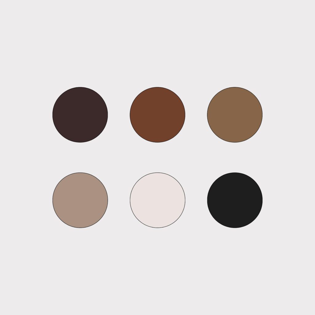
The Classic Wedding Palette: Pros and Cons
Soft blush, sage, ivory, champagne — the classic wedding industry palette is classic for a reason. It’s romantic, timeless, and broadly appealing. The downside is exactly that: broadly appealing. If you want to stand out from the hundreds of photographers and planners in your market, looking like everyone else is not your friend.
The classic palette works beautifully if it genuinely reflects your brand personality and your ideal client’s aesthetic. It starts to work against you when you chose it because it felt safe or because you saw everyone else using it. Safety in color choice usually means invisibility in the market.
Strategic Color Psychology for Different Wedding Niches
Different wedding niches call for very different color approaches. A few examples:
Luxury/editorial wedding photography tends to thrive with deep, sophisticated palettes — rich burgundies, charcoal, warm creams, aged golds. These colors communicate refinement and intentionality. They feel expensive before anyone reads a word.
Adventure and elopement photography often pairs beautifully with earthy, natural tones — slate, forest green, terracotta, warm white. These colors feel grounded and real and connected to nature, which mirrors exactly what this client values in their wedding experience.
Bright, joyful celebration planners can absolutely lean into a more vibrant palette — but with intention. A rich cobalt and warm gold reads very differently from a neon coral and lime, even if both are “colorful.” Think about what emotion you want to evoke, then choose colors that naturally trigger that feeling.
Color Implementation Beyond the Obvious
Your color palette is not just for your logo. It should live everywhere: your website backgrounds and text, your email signature, your social media templates, your client welcome materials, your Dubsado proposal. The more consistently your colors appear across every touchpoint, the more recognizable and memorable your brand becomes.
One thing I always address in brand projects: the emotional weight of different palette proportions. Having a rich, deep navy as your primary color with a warm cream accent reads completely differently than if you swap those proportions. The colors themselves matter, but how much of each you use shapes the overall feeling of your brand dramatically. This is the level of detail we work through in every custom brand project — see what that looks like here.
Practical Application: From Theory to Your Website
Ready to evaluate your current palette? Ask yourself these questions honestly: When my ideal client lands on my website, does the color palette make her feel something that aligns with my brand? Does my palette differentiate me from competitors in my market, or do I look like everyone else? Are my colors used consistently across every platform and touchpoint?
If you’re realizing your palette isn’t serving you as well as it could, that is genuinely exciting news — because it means there’s room to grow in a direction that feels more true to you and more magnetic to your dream clients. Our Showit templates are fully customizable with your brand colors, or if you’re ready for a full rebrand, come chat on the contact page. The blog has more brand strategy deep-dives too!
The Bottom Line: Strategic Color as a Booking Tool
Your color palette is doing one of two things: it’s working for you, attracting the right clients and repelling the wrong ones, building an emotional connection before a word is read. Or it’s working against you, blending in or sending the wrong signals. The beautiful thing about color is that it’s one of the most powerful branding tools you have, and it costs nothing to get right except intentionality.
Think strategically. Choose with purpose. And watch how differently the right people respond to your brand.
Cheering you on,
Sarah

Leave a Reply


LEAVE A NOTE