


Creating A Magnetic About Page: How Wedding Pros Can Tell Their Story to Book More Clients
Can I tell you something that might sting a little? Most About pages I see during website evaluations are basically glorified resumes. Name, years of experience, list of services, maybe a fun fact about loving coffee. And friend, your potential clients don’t want your resume. They want to feel like they already know you before they ever hit send on that inquiry form.
Your About page is doing one of two things right now: it’s either making someone feel seen and excited to reach out, or it’s making them click away. There is very rarely a middle ground. So let’s talk about how to turn it into one of the hardest-working pages on your entire website.
Why Your About Page Matters More Than You Think
Here’s something I’ve noticed after nearly a decade of building websites for wedding pros: the About page is almost always the second most-visited page on a site. The person who makes it there is not a casual browser. They liked what they saw on your homepage or your portfolio, and now they want to know more. They are seriously considering you. That is a HOT lead who just walked into your virtual office, and what happens next determines whether they stay or go.
The goal of your About page is not to impress them with your credentials. It’s to make them feel understood. Like you get their fears, their dreams, the specific way they think about their wedding or their business. When someone reads your About page and thinks “she is describing ME” — that’s when you’ve got them. That’s the click-to-inquire moment.
The Magnetic About Page Framework
I walk every single client through this framework when we’re building their About page together, and it works every time. Five pieces, in this order:
1. The Ideal Client Hook
Open with THEM, not you. Describe your ideal client so specifically that she reads the first line and feels like you wrote it about her. “If you’re a wedding photographer who’s tired of blending in with every other photographer in your market and ready to have a brand that finally looks like what you’re worth…” — that’s an opener that stops the right person cold. The wrong person self-selects out immediately. That’s not a problem. That’s the system working.
2. Your Unique Value Bridge
This is where you bridge from their problem to why YOU are the solution — not just any solution. What do you bring that nobody else does? For me, it’s that design has been in my family for generations. My grandmother ran a print shop. When I sit down to design a brand, I’m not just making something pretty. I’m carrying forward a legacy of craftsmanship that goes back further than I can trace. That’s mine. What’s yours?
3. The Strategic Personal Story
Here’s where you get to be a human being. Not a list of facts (“I have a golden retriever and I love tacos”) but a real story that connects to why you do what you do. The moment you knew this was your calling. The client who changed everything for you. The struggle you had early in your business that you’re now on the other side of. Real stories build real trust, and trust is what makes someone pick up the phone and call you instead of the twelve other people on their shortlist.
4. Client-Centered Process Preview
Give them just enough of a peek at what it’s like to work with you that the anxiety starts to dissolve. Not a full process breakdown (that lives on your services page) — just a feeling. “I take clients through a thoughtful discovery process because I believe the best design comes from really knowing who you are and who you want to attract.” That kind of thing. Quick. Reassuring. Warm.
5. Strategic Social Proof Integration
Drop in a testimonial right here, before your call to action. Not a five-word one. A real one, from a real client, that speaks to your personality and what it feels like to work with you. Your portfolio shows what you make. This confirms what it’s like to be in your hands. Those are two very different kinds of reassurance and both matter enormously on an About page. Check out real examples in my portfolio to see how this comes together.
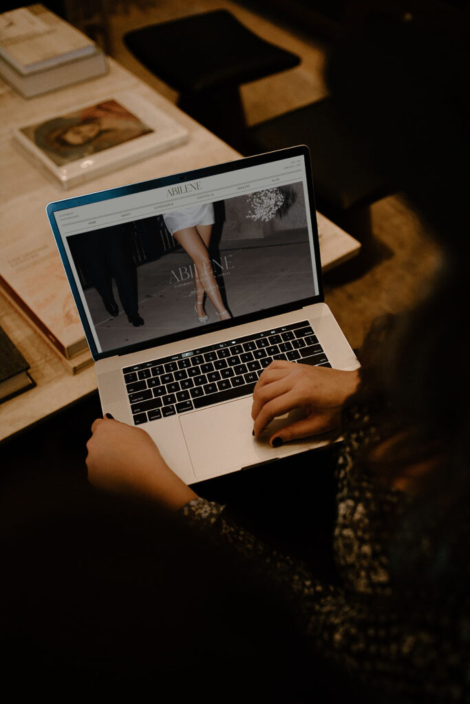
Visual Elements That Enhance Connection
The words on your About page matter enormously, but so does what people see while they’re reading them. A few things I always make sure of when I’m designing About pages for clients:
Use a photo that shows your personality, not just your professionalism. The stiff, formal headshot says “I am a serious business person.” The candid laughing photo says “I am a person you want to spend time with.” For the wedding industry especially, people are hiring someone they want around on an emotional day. Show them that version of yourself.
Break up the text with images throughout the page. A wall of text, no matter how good it is, loses people. Intersperse photos, maybe a pull quote, some white space. Make it feel like a conversation, not a lecture.
Make your brand colors and fonts feel cohesive here. The About page should feel like the same universe as your homepage. If there’s a visual disconnect, it creates a subtle sense of unease that people can’t always name but definitely feel. This is where having a real brand system (not just a logo) makes everything easier. Grab my pricing guide if you’re curious about what that process looks like.
Common About Page Mistakes to Avoid
Leading with your bio instead of their problem. I know this feels weird. It’s YOUR about page! But the fastest way to make someone care about you is to show them you already understand them. Start with them. Get to you in paragraph two.
Vague passion statements. “I have a passion for capturing love stories” is on approximately 94% of wedding photographer websites. (I made that number up, but you know I’m right.) What specifically do YOU bring that nobody else does? Get specific or get forgettable.
Random personal facts with no relevance. “I love hiking and Taylor Swift and my rescue cat named Biscuit” — unless Biscuit somehow connects to your brand story, this is just noise. Share personal things that deepen the connection to your work and your values, not just things that fill space.
No clear next step. End your About page with a call to action. Don’t just let people trail off at the bottom. Where do you want them to go? Your portfolio? Your contact page? Give them a clear, warm invitation. Something like “If this sounds like the kind of experience you’ve been looking for, I’d love to connect — come say hi on the contact page.” Easy. Friendly. Effective.
Platform-Specific Implementation Tips
Quick notes by platform: In Showit, your About page is a blank canvas with total design freedom — use it! Layer photos and text, create a layout that feels editorial and intentional, and build differently for desktop and mobile. Our Showit templates have About page layouts built in if you want a beautiful starting point. In WordPress, use the block editor to create visual breaks between sections and lean on your theme’s full-width layout options. In Squarespace, their stacked section layouts actually work nicely for the kind of story-driven About page we’re describing — just resist the urge to default to their most basic template.
Measuring Your About Page Effectiveness
Once you’ve updated your About page, give it 30 days and then check a few things in Google Analytics: How long are people spending on the page? (More than a minute is a great sign.) What percentage of people who visit your About page then go to your contact or services page? That flow is what you’re optimizing for. And informally, start asking new clients “how did you find me and what made you reach out?” You’ll be amazed how often they mention something from your About page specifically. Head to the blog for more website strategy tips!
The Bottom Line
Your About page is not a formality. It’s not the section you get to after you’ve done the “real” pages. It is one of the most powerful booking tools on your entire website, and for most wedding pros, it’s the most under-invested page they have. That is such good news, because it means there is so much room to grow here with relatively small changes.
Start with the framework. Lead with your ideal client. Share a real story. Drop in a powerful testimonial. Give them a clear next step. And if you want eyes on your actual About page to tell you specifically what’s working and what isn’t, that is exactly the kind of thing I love doing. Come chat with me on the contact page — I genuinely love this stuff.
Cheering you on,
Sarah

Leave a Reply


LEAVE A NOTE